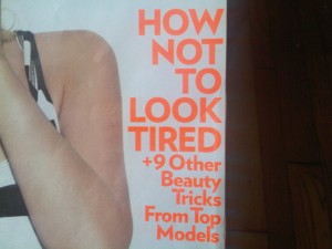
I was going through the pictures on my phone’s storage card and came across this picture of a simply horrible ad. My hunch, which I’ve talked about before (here, and here), is that they purposely picked this ridiculous picture to capture my attention (which it did).
The problem with this ad is, if I wasn’t the kind of person who takes photos of stupid crap to post on my blog, during the entire 0.8 seconds I would have looked at this ad, I would only have checked out that effed up face and not any of the words, walking away before I even knew what the ad was for. There is a good reason to push something ridiculous to jump out and grab attention, but you still have to stick the landing… and in my opinion they failed horribly.
Now this next thing is grammar related. In this cover blurb, I’m sure they meant to say “How to not look tired”, but because every single shitmag graphic designer and editor is so used to useless BS magspeak like “What not to wear”, they phrased it this way:
Basically, by changing the order of the wording, that sentence (if you could call it that) is saying you want to look tired, but there is a correct way to look tired, and an incorrect way to look tired, and they are going to help you not look the wrong kind of tired… or in straight forward language, they are going to tell you “how to look look tired the right way”. Idiots.
This photo takes the cake for stupid crap I’ve seen lately. It was a photo included as a letter to the editor where this dumbass reader took her shitmag to the slums of Brazil to try to “brighten their day”.


